ShopDreamUp AI ArtDreamUp
Deviation Actions
Description
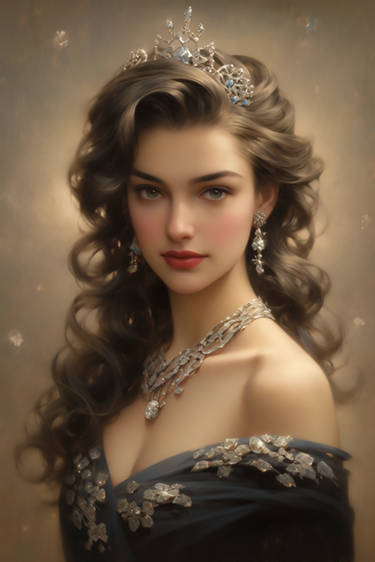
Been noodling on this photo study of Arizona Muse for the past week; I’d like to experiment with it more but I think I’m going to be busy for the next few weeks looking at interior design and furnitures so I’m making myself post it ! It’s somehow relaxing to slap on paint and study a photo, I wonder why I don’t do it more often.
If you're interested in seeing the process, check out my tumblr: [link]
If you're interested in seeing the process, check out my tumblr: [link]
Image size
990x765px 152.72 KB
© 2012 - 2024 Derlaine8
Comments11
Join the community to add your comment. Already a deviant? Log In
Alright... I don't too many of these, but here goes:
Some things to consider right out:
- The head being in the exact center of the image plane. This tends to break the interest for some viewers.
Suggestion: Off-center that baby! Let the beautiful curly hair that you've meticulously rendered be the pull that brings the eyes to the subject.
- Beware of strong verticals when you made a majority of the piece so angled. Think about what you are going to do a bit ahead of time and you'll be able to avoid things like the bleed into her clothing on the right. Also, that big vertical line just pulls my eye that way too far because of the brightness compared to the muted of the rest of the image.
Things that I really enjoy:
- The rendering of course! The fact that you kept some of this piece nice and loose and then fully rendered the focal point only reinforces this piece further. You've made a great focal point here and I am glad that you didn't try to bounce my eyes around with too many details in other spots.
- Muted color choice. This is a subtle and really nice touch to the piece overall. Good palette for this one!
Other notes:
- I'm not quite sure how I feel about the highlights when there seems to be no clear light source that would designate her cheek being THAT shiny. I would check the lights, and above all, be very, very careful with white. This is, for the most part, an unnatural color. It is sort of deadening the immersion of this piece.
- In that same vein, the fact that you used so many blacks kind of flattens the piece. Try to think about the color wheel always when painting (I can't really go into specifics here as I am lacking in this department as well).
Overall, this looks like a solid piece, and a good ode to the art of yore. I think you are on the right track, I would just check a few small details on your next go around.
Keep up the good work, and I hope to see more soon!


